Tailwind CSS: Design Without Asking a Designer
Patients do not trust ugly calculators. Tailwind helps physician-developers build interfaces that feel clean, credible, and ready to use.
Listen to this post
Tailwind CSS: Design Without Asking a Designer
A colleague showed me a blood pressure tracker he had built for his hypertension clinic. The logic was solid. It stored readings, calculated averages, and flagged values above threshold. He had spent three weekends on it.
The patients were not using it.
He asked them why. The most common answer was some version of the same thing: it looked like a form from 1999, and they were not sure it was safe. The interface communicated neglect, and neglect communicated risk.
He had solved the clinical problem and lost on the design problem.
Why Design Is a Clinical Intervention
Physicians understand this intuitively when it comes to physical space. A well-lit, organized, uncluttered exam room communicates competence. A waiting room with broken chairs and faded magazines communicates something else.
The same principle operates on a screen.
Patients make trust decisions in the first three seconds they see an interface. If a clinical calculator looks unprofessional, patients assume the underlying logic is unprofessional. If a patient education page is hard to read, patients do not read it. A clinical tool that is not used has zero benefit, regardless of how correct the logic is.
Design is not decoration. It is part of the intervention.
The objection I hear from physician-developers is: “I am not a designer. I cannot do this.” That is the wrong frame. You do not need to be a designer. You need a system that makes good defaults easy. Tailwind is that system.
What Tailwind Is
Traditional CSS is written in separate files. You define classes, give them properties, and apply those classes to HTML elements.
/* Traditional CSS */
.button {
  background-color: #1d4ed8;
  color: white;
  padding: 10px 20px;
  border-radius: 6px;
  font-size: 1rem;
}<button class="button">Calculate Risk</button>Tailwind inverts this. Instead of writing CSS and naming classes, you apply small pre-defined utility classes directly in the HTML.
<!-- Tailwind -->
<button class="bg-blue-700 text-white px-5 py-2.5 rounded-md text-base">
  Calculate Risk
</button>
Each class does one thing. bg-blue-700 sets the background color. text-white sets the text color. px-5 sets left and right padding. py-2.5 sets top and bottom padding. rounded-md sets border radius.
The result is identical to the traditional CSS version. But there is no separate CSS file to maintain, no class names to invent, no specificity conflicts to debug.
The Classes That Do Eighty Percent of the Work
You do not need to memorize Tailwind. The system has a consistent naming pattern. Once you know the pattern, you can guess most class names correctly.
Spacing
Padding and margin follow a numeric scale where 1 unit is 4px.
p-4    = padding: 16px (all sides)
px-4   = padding-left and padding-right: 16px
py-4   = padding-top and padding-bottom: 16px
pt-2   = padding-top: 8px
m-4    = margin: 16px
mx-auto = margin-left: auto; margin-right: auto (centers a block element)
space-y-4 = vertical gap between children: 16px
For a clinical form, p-4 on a card container and space-y-4 between form fields handles most of your spacing needs.
Typography
text-sm     = font-size: 0.875rem
text-base   = font-size: 1rem
text-lg     = font-size: 1.125rem
text-xl     = font-size: 1.25rem
text-2xl    = font-size: 1.5rem
font-normal = font-weight: 400
font-medium = font-weight: 500
font-semibold = font-weight: 600
font-bold   = font-weight: 700
text-gray-600 = color: medium gray
text-gray-900 = color: near-black
leading-relaxed = line-height: 1.625 (good for body text)
Color
Tailwind has a built-in color palette with shades from 50 (nearly white) to 950 (nearly black). The names are consistent across colors.
bg-blue-700   = blue background, medium-dark
bg-red-50     = red background, very light (good for warning zones)
bg-green-50   = green background, very light (good for safe zones)
border-gray-200 = light gray border
text-blue-700 = blue text
For clinical status indicators: red for high-risk, yellow for moderate, green for low-risk, blue for neutral information. This maps directly to the risk tiers in our calculator.
Layout
flex          = display: flex
flex-col      = flex-direction: column
items-center  = align-items: center
justify-between = justify-content: space-between
gap-4         = gap: 16px (between flex or grid children)
w-full        = width: 100%
max-w-2xl     = max-width: 42rem (good for content columns)
grid          = display: grid
grid-cols-2   = two-column grid
Borders and shadows
border        = border: 1px solid (default gray)
border-gray-200 = light gray border
rounded       = border-radius: 4px
rounded-lg    = border-radius: 8px
rounded-xl    = border-radius: 12px
shadow-sm     = subtle box shadow
shadow        = standard box shadow
States
Tailwind handles hover, focus, and responsive states with prefixes.
hover:bg-blue-800     = background changes on hover
focus:ring-2          = focus ring for accessibility
focus:ring-blue-500
md:grid-cols-2        = two columns on medium screens and wider
Hands-On: Styling the Risk Companion
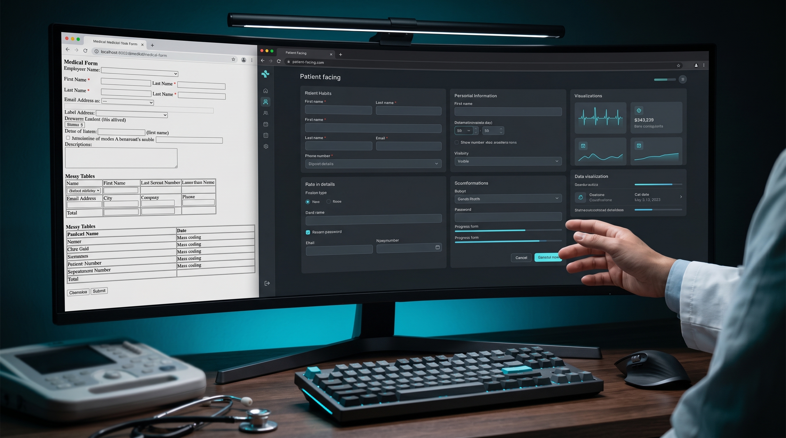
We are going to style the Preeclampsia Risk Companion. This picks up the Astro project from Post 6. By the end, the Risk Companion will look like a professional clinical tool.
The styled risk calculator component
Replace the RiskSlider.tsx from Post 5 with this fully styled version:
// src/components/RiskCalculator.tsx
// Full styled risk calculator with Tailwind.
// Replaces the v1 HTML calculator and v2 TypeScript version.

import { useState } from "react";

type RiskTier = "high" | "moderate-multiple" | "moderate-single" | "low";

interface RiskResult {
  tier: RiskTier;
  label: string;
  detail: string;
  aspirinRecommended: boolean;
  aspirinGuidance: string;
}

const HIGH_RISK_FACTORS = [
  { value: "prior_preeclampsia", label: "Prior preeclampsia, especially with adverse outcomes" },
  { value: "multifetal",         label: "Multifetal gestation" },
  { value: "chronic_htn",        label: "Chronic hypertension" },
  { value: "diabetes",           label: "Type 1 or Type 2 diabetes" },
  { value: "kidney_disease",     label: "Kidney disease" },
  { value: "autoimmune",         label: "Autoimmune condition (SLE, antiphospholipid syndrome)" },
];

const MODERATE_RISK_FACTORS = [
  { value: "nulliparous",     label: "Nulliparity" },
  { value: "obesity",         label: "Obesity (BMI > 30)" },
  { value: "family_history",  label: "Family history of preeclampsia (mother or sister)" },
  { value: "age_over_35",     label: "Age 35 or older at delivery" },
  { value: "low_income",      label: "Low socioeconomic status" },
  { value: "prior_adverse",   label: "Prior adverse pregnancy outcome (IUGR, abruption, fetal demise)" },
  { value: "interval_over_10", label: "Interpregnancy interval greater than 10 years" },
];

function calculateRisk(high: string[], moderate: string[]): RiskResult {
  if (high.length >= 1) {
    return {
      tier: "high",
      label: "High Risk",
      detail: `${high.length} high-risk factor${high.length > 1 ? "s" : ""} identified.`,
      aspirinRecommended: true,
      aspirinGuidance: "Low-dose aspirin (81 mg/day) recommended. Start between 12 and 28 weeks, optimally before 16 weeks.",
    };
  }
  if (moderate.length >= 2) {
    return {
      tier: "moderate-multiple",
      label: "Moderate Risk",
      detail: `${moderate.length} moderate-risk factors identified.`,
      aspirinRecommended: true,
      aspirinGuidance: "Consider low-dose aspirin. Multiple moderate-risk factors support prophylaxis.",
    };
  }
  if (moderate.length === 1) {
    return {
      tier: "moderate-single",
      label: "Moderate Risk (single factor)",
      detail: "1 moderate-risk factor identified.",
      aspirinRecommended: false,
      aspirinGuidance: "Aspirin not routinely recommended for a single moderate-risk factor. Document and monitor.",
    };
  }
  return {
    tier: "low",
    label: "Low Risk",
    detail: "No high-risk or moderate-risk factors identified.",
    aspirinRecommended: false,
    aspirinGuidance: "Routine prenatal care. No aspirin prophylaxis indicated.",
  };
}

const TIER_STYLES: Record<RiskTier, string> = {
  "high":              "bg-red-50 border-red-300 text-red-900",
  "moderate-multiple": "bg-yellow-50 border-yellow-300 text-yellow-900",
  "moderate-single":   "bg-yellow-50 border-yellow-300 text-yellow-900",
  "low":               "bg-green-50 border-green-300 text-green-900",
};

function CheckboxGroup({
  legend,
  hint,
  factors,
  selected,
  onChange,
}: {
  legend: string;
  hint: string;
  factors: { value: string; label: string }[];
  selected: string[];
  onChange: (values: string[]) => void;
}) {
  function toggle(value: string) {
    onChange(
      selected.includes(value)
        ? selected.filter((v) => v !== value)
        : [...selected, value]
    );
  }

  return (
    <fieldset className="border border-gray-200 rounded-lg p-5">
      <legend className="px-2 font-semibold text-gray-800">{legend}</legend>
      <p className="text-sm text-gray-500 mb-3">{hint}</p>
      <div className="space-y-2">
        {factors.map((factor) => (
          <label
            key={factor.value}
            className="flex items-start gap-3 cursor-pointer group"
          >
            <input
              type="checkbox"
              className="mt-0.5 h-4 w-4 rounded border-gray-300 text-blue-600 focus:ring-blue-500"
              checked={selected.includes(factor.value)}
              onChange={() => toggle(factor.value)}
            />
            <span className="text-sm text-gray-700 group-hover:text-gray-900 leading-snug">
              {factor.label}
            </span>
          </label>
        ))}
      </div>
    </fieldset>
  );
}

export function RiskCalculator() {
  const [highSelected, setHighSelected] = useState<string[]>([]);
  const [moderateSelected, setModerateSelected] = useState<string[]>([]);
  const [result, setResult] = useState<RiskResult | null>(null);

  function onCalculate() {
    setResult(calculateRisk(highSelected, moderateSelected));
  }

  return (
    <div className="my-8 font-sans">
      <div className="space-y-5">
        <CheckboxGroup
          legend="High-Risk Factors"
          hint="One high-risk factor is sufficient to recommend low-dose aspirin."
          factors={HIGH_RISK_FACTORS}
          selected={highSelected}
          onChange={setHighSelected}
        />
        <CheckboxGroup
          legend="Moderate-Risk Factors"
          hint="Consider aspirin with two or more moderate-risk factors."
          factors={MODERATE_RISK_FACTORS}
          selected={moderateSelected}
          onChange={setModerateSelected}
        />
      </div>

      <button
        onClick={onCalculate}
        className="mt-5 w-full bg-blue-700 hover:bg-blue-800 text-white font-semibold py-3 px-6 rounded-lg transition-colors focus:outline-none focus:ring-2 focus:ring-blue-500 focus:ring-offset-2"
      >
        Calculate Risk
      </button>

      {result && (
        <div className={`mt-5 border rounded-lg p-5 ${TIER_STYLES[result.tier]}`}>
          <p className="font-bold text-lg mb-1">{result.label}</p>
          <p className="text-sm mb-3">{result.detail}</p>
          <div className="bg-white bg-opacity-60 rounded p-3 border-l-4 border-blue-400">
            <p className="text-sm">
              <span className="font-semibold">Aspirin guidance: </span>
              {result.aspirinGuidance}
            </p>
          </div>
        </div>
      )}

      <p className="mt-4 text-xs text-gray-400">
        Based on ACOG Practice Bulletin 222. Clinical decision support only.
        No patient data is stored or transmitted.
      </p>
    </div>
  );
}
Use the Tailwind typography plugin for MDX prose
The @tailwindcss/typography plugin applies clean, readable styles to long-form prose rendered from Markdown and MDX. Install it:
npm install -D @tailwindcss/typographyAdd it to tailwind.config.mjs:
// tailwind.config.mjs
export default {
  content: ["./src/**/*.{astro,html,js,jsx,ts,tsx,mdx}"],
  theme: {
    extend: {},
  },
  plugins: [
    require("@tailwindcss/typography"),
  ],
};
In src/pages/blog/[...slug].astro, wrap the rendered content in the prose class:
<article class="prose prose-gray max-w-none prose-headings:font-semibold prose-a:text-blue-700">
  <Content />
</article>
The prose class applies typographic defaults to everything inside it: heading sizes, paragraph spacing, link colors, code block styling, list indentation. You do not write any of this yourself.
The styled home page
Update src/pages/index.astro to use Tailwind utility classes throughout:
---
import { getCollection } from "astro:content";
import BaseLayout from "../layouts/BaseLayout.astro";
const posts = await getCollection("posts");
const sorted = posts.sort(
(a, b) => b.data.pubDate.valueOf() - a.data.pubDate.valueOf()
);
---
<BaseLayout
title="Preeclampsia Risk Companion"
description="Clinical decision support and patient education for preeclampsia risk."
>
<div class="mb-10">
<h1 class="text-3xl font-bold text-gray-900 mb-2">
Preeclampsia Risk Companion
</h1>
<p class="text-gray-500 text-lg leading-relaxed">
Decision support and patient education built for physicians,
by a physician.
</p>
</div>
<ul class="space-y-3">
{sorted.map((post) => (
<li>
<a
href={`/blog/${post.slug}`}
class="block border border-gray-200 rounded-xl p-5 hover:border-blue-300 hover:shadow-sm transition-all group"
>
<p class="font-semibold text-blue-700 group-hover:text-blue-800 mb-1">
{post.data.title}
</p>
<p class="text-sm text-gray-500 leading-relaxed">
{post.data.description}
</p>
<p class="text-xs text-gray-400 mt-2">
{post.data.category} ·{" "}
{post.data.pubDate.toLocaleDateString("en-US", {
month: "long",
year: "numeric",
})}
</p>
</a>
</li>
))}
</ul>
</BaseLayout>Run the dev server and compare what you see now to the unstyled version from Post 6.
What Can Go Wrong
Classes are written correctly but styles are not applying. Tailwind scans your source files and generates only the CSS classes you actually use. If a class appears in a dynamically constructed string, Tailwind may not detect it. Write full class names as literals rather than building them with string interpolation.
// Wrong: Tailwind cannot detect these at build time
const color = "red";
className={`bg-${color}-50`}

// Right: full class names as literals
className={tier === "high" ? "bg-red-50" : "bg-green-50"}
The prose class is applied but code blocks look unstyled. Install the typography plugin if you have not already, and verify it is listed in tailwind.config.mjs under plugins. Rebuild the dev server after changing the Tailwind config.
Hover states work on desktop but not on mobile. On touch devices, hover: states behave differently. For primary interactive elements like buttons, use active: states as a fallback. For cards that link somewhere, verify the tap target is large enough — minimum 44px height.
The layout breaks on small screens. Tailwind is mobile-first. Unprefixed classes apply at all screen sizes. Classes prefixed with md: apply at medium screens and wider. If the layout looks correct on desktop but breaks on mobile, a fixed-width class (like w-96) is probably the cause. Replace it with w-full max-w-sm or similar.
Closing
My colleague with the unused blood pressure tracker restyled his interface in one afternoon. He kept every line of clinical logic. He replaced every CSS file with Tailwind utility classes. He ran it by one patient in the waiting room before sending it out.
The patient said it looked professional. She started using it.
That was the whole change.
Design is the interface between the work you did and the patient who needs it. Tailwind is how you build that interface without having spent a career learning it.
In Post 8, we add the layer that makes the tool longitudinal: a Postgres database backed by Prisma.
Related Posts

The Rare Condition You Have Seen Ten Times
Why a physician's second brain turns scattered rare cases into a queryable clinical registry owned by the clinician who lived them.

Clinical AI Should Help Us Find the Growth Restriction Cases We Miss
Fetal growth restriction is not just an ultrasound diagnosis. It is a longitudinal data problem. Clinical AI will not replace MFM judgment, but it can help surface the pregnancies whose risk is already visible in the record.
The Lemonade Machine Problem
Automation in medicine should not be judged against an ideal clinician. It should be judged against real human variance, machine variance, supervision, and the cost of failure.

Maternal-Fetal Medicine Specialist